Lost in Translation:
Bridging Cultural Navigation Gaps in Johannesburg’s Gautrain System
TL;DR
As the Gautrain, South Africa’s only rapid rail network, prepares for a R120 billion expansion, I was contracted by the Gautrain Management Agency to investigate and address a critical issue: wayfinding.
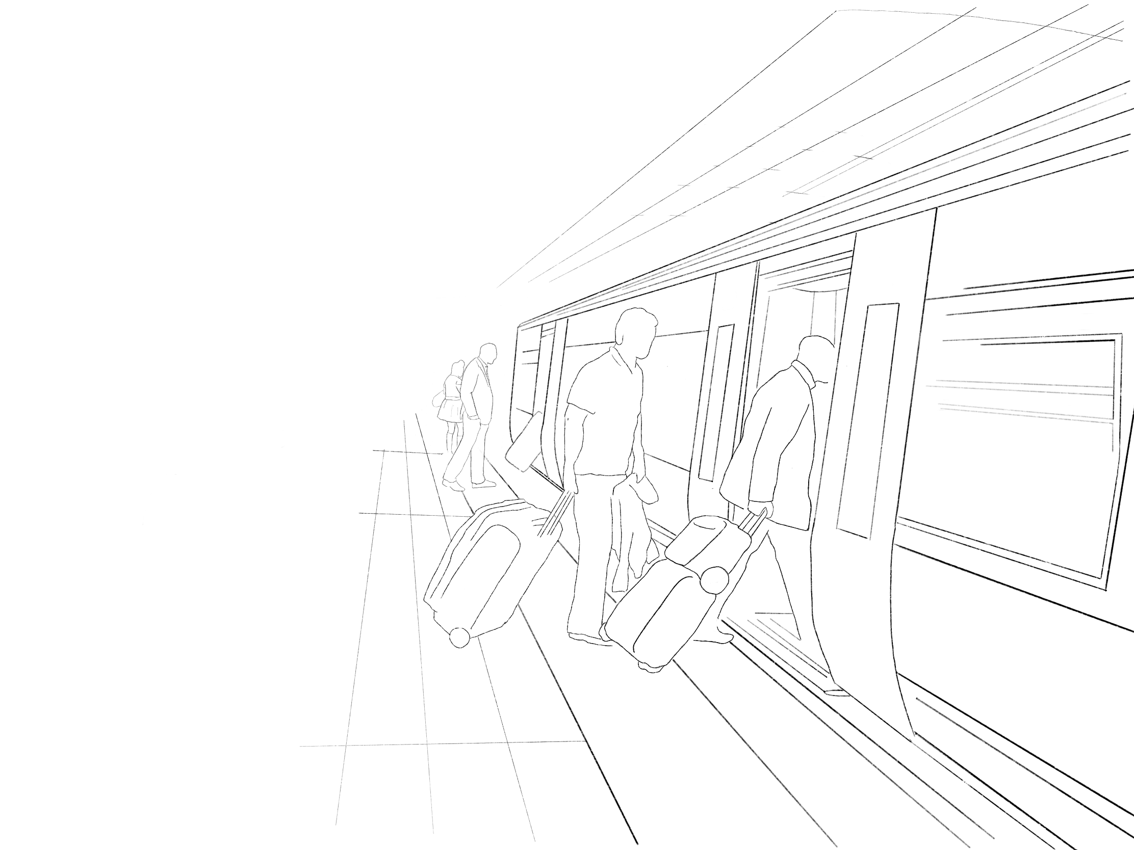
Despite its modern infrastructure, the system proves confusing for many passengers, especially locals, who frequently seek help from station staff while navigating between its 10 stations.
Through a ‘UX-led’ process that included a full design audit, on-site observational research, and interviews with frontline staff, I uncovered a key mismatch: while the network’s signage relied on a survey perspective (map-based, cardinal directions), Johannesburg commuters intuitively navigate using a route perspective (landmarks, left/right directions).
Rooted in the city’s informal, organically grown layout and shaped by its history as a mining hub, this cognitive gap left many users disoriented.
Drawing on urban navigation theory, local language patterns, and behavioural design, I proposed human-centred interventions including landmark-based signage, intuitive colour coding, culturally resonant artwork, and improved iconography.
The interventions were designed to be inclusive, scalable, and culturally grounded, bridging the gap between infrastructure and intuition, and preparing the Gautrain for a more accessible, commuter-friendly future.

After

Before
This work is important to me because…
Growing up in Johannesburg, I gained a firsthand understanding of how South Africans navigate.
The city doesn’t lend itself to abstract grids—it speaks in landmarks, traffic lights (“robots”), and lived experience.
My passion lies in creating design systems that respect how people actually think and move through space, rather than forcing them to adapt to rigid, imported models.
This project let me blend behavioural design, ethnographic research, cultural insight, and practical UX thinking to solve a real-world problem that directly impacts mobility, accessibility, and economic participation.
This work is important to you because…
This case study demonstrates my ability to:
Apply UX principles to complex physical systems
Conduct observational and stakeholder-driven research under real-world constraints
Identify deep cognitive mismatches between system design and user behaviour
Translate behavioural insights into actionable, scalable interventions
Communicate cultural nuance to clients in ways that lead to informed design decisions

After

Before
Long Form Case Study
Context
The Gautrain is South Africa’s only rapid rail network, spanning 80 kilometres and linking Johannesburg with Pretoria, OR Tambo International Airport, and surrounding hubs. While modest in size with only 10 stations, it remains a symbol of post-apartheid progress and offers fast, safe, and modern transport to a wide range of users, including daily commuters, occasional local travellers, and international tourists.
In 2025, the Gautrain Management Agency (GMA) announced a R120 billion expansion, aiming to increase coverage and ridership.
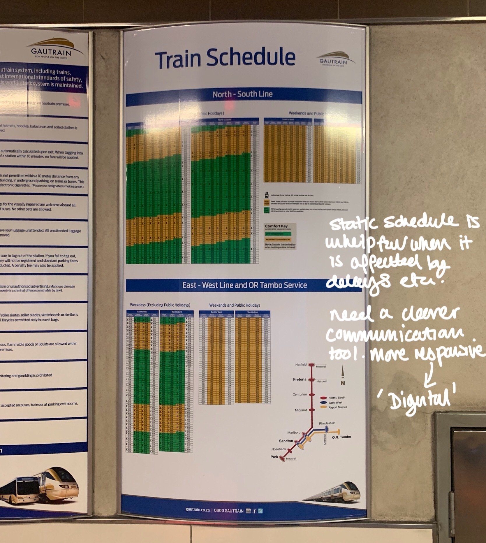
However, at the Gautrain Innovation Seminar (2021), where I served as a panellist, wayfinding was raised as a persistent issue. At its core, wayfinding refers to the information system that helps individuals navigate through a space. Effective wayfinding has the potential to positively shape a passenger’s experience and transform an otherwise frustrating commute into an enjoyable journey.
Passengers frequently found the system confusing, especially first-time users. The GMA subsequently brought me on to investigate the system and propose human-centred, scalable solutions for improving navigation ahead of the expansion.
Problem Statement
Despite world-class infrastructure, the Gautrain’s wayfinding system remains disorienting to many passengers, who regularly seek help from station staff to navigate between only 10 stations.
As the system prepares to grow, this disconnect threatens to scale with it. There is an urgent need for a culturally-informed, behaviorally-driven wayfinding solution that improves passenger navigation and supports an inclusive, intuitive transit experience.
Research
Design Review


Research Approach
Although I wasn’t permitted to interview passengers directly, I conducted a UX-style audit of the system, including:
Design review: Marked-up imagery of signage, architecture, and passenger flow.
Observational research: Tracking user behaviour across multiple stations.
Interviews with staff: Conversations with security, station managers, and attendants.
Behavioural literature: Including academic studies on wayfinding psychology.

Interview Insight
Staff interviews revealed an essential paradox: although signage was “everywhere,” passengers routinely needed to be personally guided.
The system wasn’t failing in design execution, it was failing to match how its users cognitively navigate space.

Key Insight: Route vs. Survey Perspectives
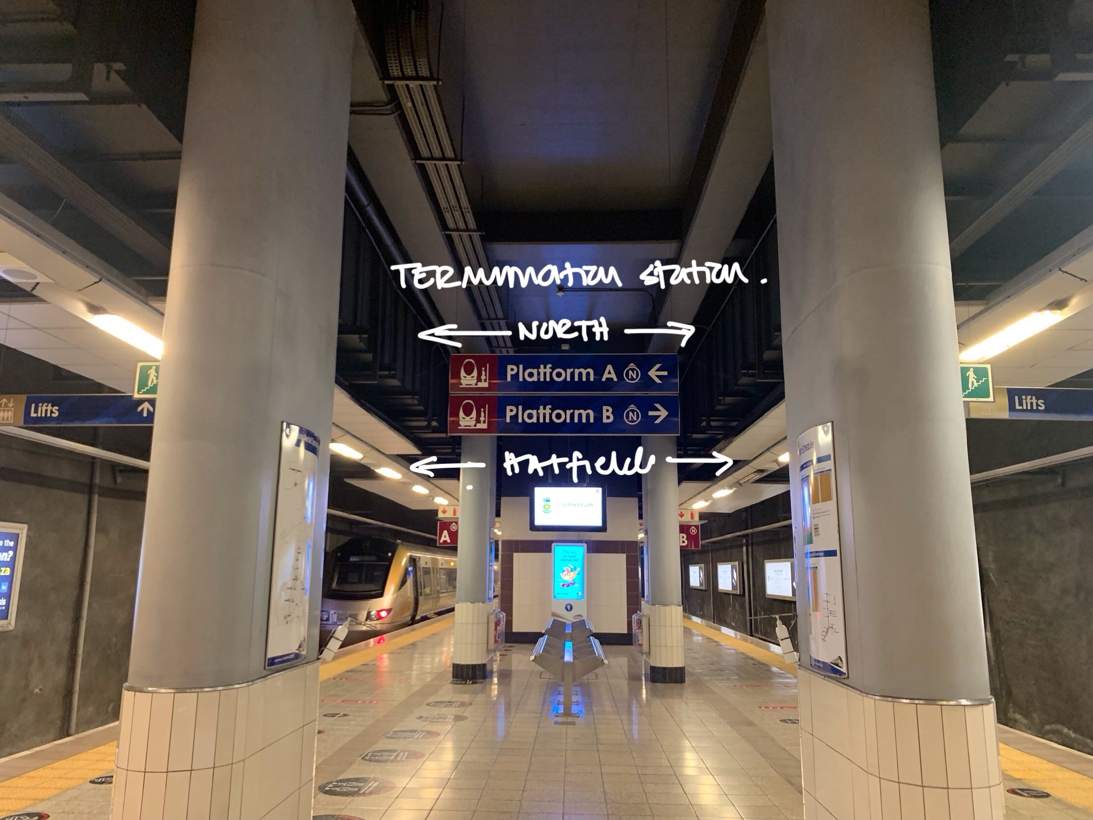
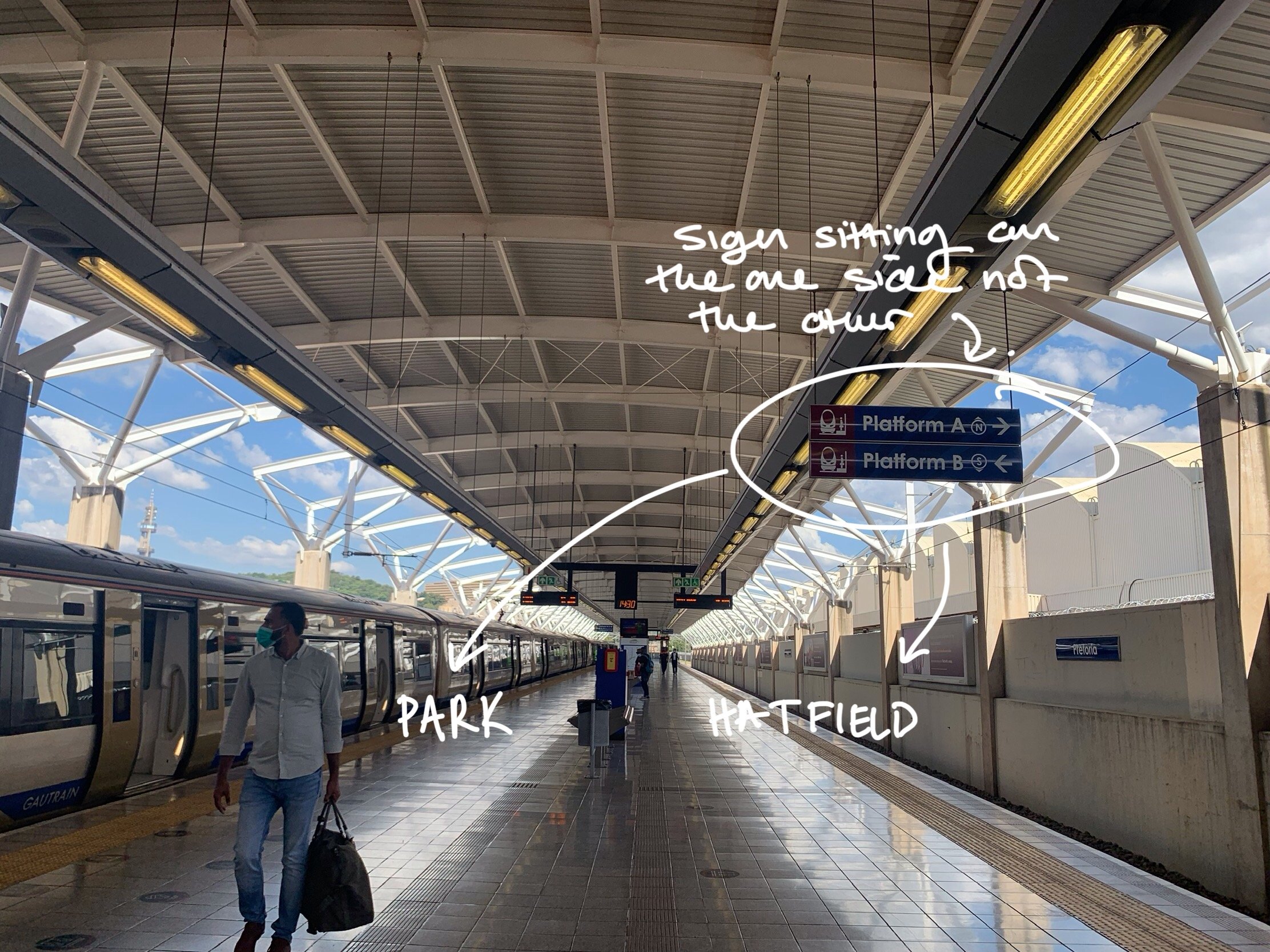
Drawing on wayfinding research (Hund et al., 2012), I identified the core disconnect: the Gautrain uses a survey perspective—map-like, with cardinal directions—while Johannesburg locals predominantly use a route perspective—landmark-based, egocentric directions with terms like “left,” “right,” and “after the KFC.”
This difference is not merely semantic; it’s cultural and cognitive.
Cities like Manhattan (grid-based) support survey-based wayfinding.
Cities like London (quadrant-based) blend survey and route.
Johannesburg, founded in 1886 during a gold rush, developed rapidly and informally. It lacks a coherent street grid or quadrant system. Most locals navigate using memory, experience, and prominent landmarks.
This cultural context explains why locals struggle with signage reliant on compass directions or abstract line names. Yet international tourists, another key user group, are more likely to rely on the survey model. Any effective solution must bridge these mental models.

Recomendations
Transition to wayfinding that utilises the route perspective
Reframe signage and instructions to align with how locals give directions using landmarks and relative movement rather than cardinal directions.Prioritise the destination (landmark) in signage over direction or platform
Signage should lead with recognisable endpoints or key stops (e.g. “To Sandton” or “To OR Tambo Airport”) rather than “Northbound” or “Platform 2.”Contract local artists to make stations visually and culturally distinct
Use commissioned public art to make each station memorable and unique, helping users associate visual cues with place identity.Change line names from East/West and North/South to ‘colours’
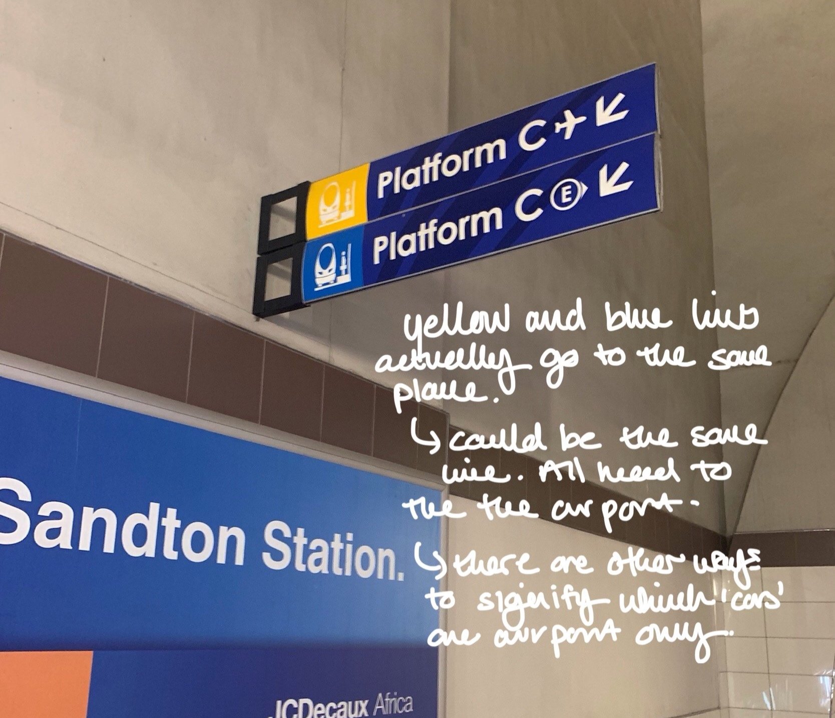
Reduce cognitive friction by emphasising visual colour-coding (e.g. “Red Line” or “Blue Line”) rather than directional terminology, which confuses many local users.Amalgamate the East/West (Blue) and Airport (Yellow) lines into a single continuous line
As trains never terminate at Rhodesfield, maintaining this artificial split creates unnecessary confusion. Representing it as one unified line on maps and signage better reflects actual service patterns and simplifies navigation.Enhance the use of iconography as a directional tool
Introduce universally understood icons and pictograms (e.g. aeroplane for airport, suitcase for business district) to support comprehension across language and literacy barriers.

After

Before